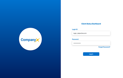
Sofvie Dashboard

Overview
Sofvie Inc. is a SaaS company that helps other workplaces improve their communication and risk management. While they mainly work with mining companies, they also extend their services to construction and manufacturing businesses.
Client Goal
Our team was enlisted to help design an internal dashboard that all Sofvie employees could access to find data that would support their business decisions and keep them informed on Sofvie’s progress and status. Currently, Sofvie lacks a place to access important data, causing workers to spend over 2 hours just to find the information.
Solution
Through speaking directly with our target users and keeping them our top priority, we were able to design a dashboard curated to their needs, allowing them to spend less time searching and easily view the data they need in one centralized place.
My Role
UX Researcher & Designer
Team
UX Researcher & Designer:
Pianpian (Nancy) Liu
Auboni Poddar
Xue (Snow) Yu
Data Scientists:
Xiang (Alison) Liu
Sidney Shapiro
Duration
Mar - Apr 2023 (4 weeks)
Tools
Figma
Figjam
Process

Discovery
Bucket Sort
While we were given different data points that needed to be on the dashboard, we had no idea which ones needed to be grouped together or which ones had a higher priority over others.

Challenge
Our final interview was with Sofvie’s CIO, who was the original stakeholder of this project. We found that there were many added data points given to us that he hadn’t approved and wasn’t willing to put on the dashboard due to the sensitivity of the information.
Despite this setback, we took his feedback to re-scope and re-plan our project, allowing us to continue with our work and remain on schedule without needing to redo the previous interviews.
Design
Based on the results of our bucket sort test, we divided the dashboard into multiple pages with tabs, categorising and organising our data points, so we could move on to design our dashboard screens.
Low-Fidelity Designs
After spending some time sketching possible graph depictions, our team split up into groups to design different pages to be time efficient, then met up later to discuss our opinions on the various possible layouts.
High-Fidelity Designs
After meeting with Sofvie and receiving feedback on our initial designs, we started the high-fidelity designs of the dashboard by agreeing on layout guidelines for consistency through working on the homepage together.
Each member was assigned specific pages to work on, where I was responsible for three pages: Login, Incident & Hazard, and Support Engagement.
Validate
Impression Test
Rather than trying to make our participants complete tasks, it was more important to see if they could understand data based on how it was presented.


While the overall dashboard layout and design was well received by the testing participants, there were still some problems with the usability.

Final Results
For our final hand-off, our team did one last presentation about the updates made based on our tests. We also packaged up our notes and recordings of our interviews and tests, as well as documentation with ideas for future iterations, along with our prototype link to give to Sofvie.

Overall, Sofvie was very pleased with our process and design, mentioning that our team was meticulous and thorough, raising the standards for their future projects.
Reflect
Learnings
This project provided me with an opportunity to gain a deeper understanding of Figma and experience doing UX work in a team setting. Throughout the process, I received guidance on framing within auto-layout, while I reciprocated by teaching them about components and instances, allowing us to stay consistent with our designs and save time throughout the process.
Future Possibilities
While we were restricted by time, there were some possibilities our team thought of for future iterations based on the impressions test feedback that we had gotten.
-
Homepage customization per user instead of one overall shared homepage for all employees, through individually selecting which cards they deem are most important.
-
Alerts and notifications to bring attention to significant changes in the data.
.png)
.png)


.png)
.png)

